Key Takeaways
- Mobile table UI elements are essential for organizing complex data on small screens.
- Responsive design and adaptive layouts improve readability and usability.
- Innovative features like collapsible rows and horizontal scrolling enhance user interaction.
- Adhering to best practices ensures accessibility and user satisfaction.
In today’s fast-paced digital world, presenting data effectively on mobile devices is more crucial than ever. With users increasingly relying on their smartphones to access critical information, the way data is displayed can have a profound impact on usability and satisfaction. Mobile table UI elements have emerged as a vital tool, enabling designers to organize complex data into clear, accessible formats without overwhelming the user. As organizations and developers continue to prioritize mobile-first strategies, mastering mobile table interfaces is now an essential skill.
At the core of modern mobile design, well-implemented tables streamline data interaction and simplify decision-making. The growth of fintech apps, healthcare portals, and productivity platforms illustrates a widespread shift toward intuitive mobile data solutions. These UI elements provide significant flexibility, from financial overviews to inventory management, proving indispensable for both users and businesses alike.
Adopting a mobile-centric mindset allows designers to overcome constraints associated with limited screen real estate. This ongoing transition has led to the development of advanced table components, providing new ways to view, filter, and interact with data efficiently. Not only do such tables help deliver information faster, but they also offer higher accessibility, allowing users of different abilities to access crucial content without barriers.
Throughout sectors from e-commerce to project management, businesses that leverage adaptive, interactive table components report stronger engagement metrics and reduced user frustration. Insightful research and real-world case studies highlight how innovations in mobile table UI design can directly correlate with improved retention and productivity. For more about digital design best practices, see current trends reported by Smashing Magazine.
Responsive Design: Adapting Tables for Mobile Screens
One of the fundamental challenges in mobile UI design is ensuring that tables retain clarity and functionality regardless of device size. Responsive design solutions address this barrier, allowing tables to automatically adjust their structure to fit various screen widths. Media queries, dynamic column hiding, and fluid layouts are all crucial techniques that maintain order and readability when transferring content from desktop to mobile environments.
Developers and designers frequently reimagine traditional table elements, prioritizing the most important data while simplifying non-critical fields for mobile. This approach guarantees that users receive a seamless, intuitive experience even when navigating dense data sets in real time or under time constraints.
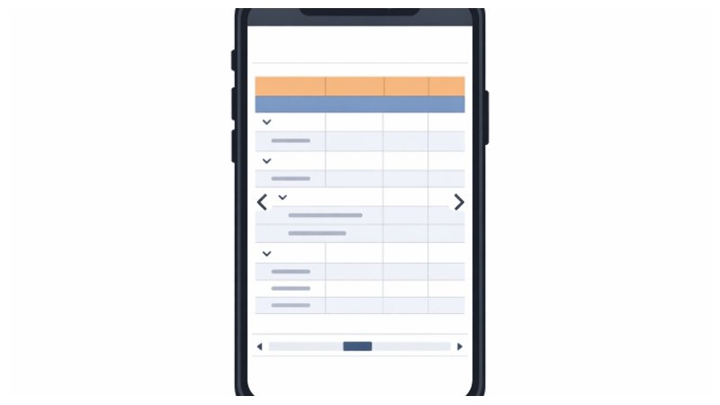
Collapsible Rows: Enhancing Data Accessibility
Collapsible rows offer a practical way to maximize mobile screen real estate. When tables hold multiple categories or layered details, expandable sections make it easy to reveal only what the user currently needs. This collapsible design supports quick data browsing and reduces visual overload, while still offering access to deeper information on demand.
This feature is especially valuable in applications where summarizing data is permitted, but deeper exploration is sometimes necessary, such as in scheduling apps or analytics dashboards. By grouping information hierarchically, collapsible rows empower users to maintain focus and efficiency.
Horizontal Scrolling: Managing Wide Data Sets
In situations where extensive columns are essential, horizontal scrolling solves the classic problem of fitting wide tables on slim screens. By enabling a swipe gesture to access additional columns, designers preserve the original structure without hiding valuable content. Visual cues such as arrows, sticky side panels, or faint scrollbars further assist users in discovering more data along the horizontal axis.
Horizontal scrolling is effective when implemented thoughtfully, and always paired with clear navigation signals, ensuring users do not miss out on key information due to limited viewing space. This method has been widely adopted in financial dashboards and inventory management systems, both of which require granular and comprehensive overviews.
Sticky Headers: Maintaining Context
Sticky headers improve user orientation within long data tables by keeping column titles or categories always visible at the top of the screen. Especially in scenarios where users scroll extensively, this feature prevents confusion and helps maintain context, making interpretation of rows quick and efficient.
Sticky headers also encourage easier data comparison and referencing, allowing mobile users to confidently scan and interpret information. According to a recent analysis published by Nielsen Norman Group, sticky features reduce cognitive load and navigation errors, reinforcing their importance in modern mobile table UI design.
Accessibility Considerations: Inclusive Design Practices
Modern mobile table interfaces must adhere to strict accessibility standards to cater to a broad audience. Techniques such as semantic HTML, sufficient color contrast, keyboard navigation support, and thorough screen reader testing can help guarantee inclusivity. Proactively identifying barriers leads to equitable experiences and promotes legal compliance in regions where digital accessibility is enforced.
Ensuring comprehensive accessibility enhances not only usability for those with disabilities, but also the overall experience for all users. Simpler navigation, clear labeling, and adjustable display settings serve diverse user needs and preferences.
Real-World Applications: Case Studies
Across industries, well-designed mobile tables have helped organizations increase efficiency and engagement. For example, major banks and e-commerce platforms report higher task completion rates and lower abandonment when data tables are responsive and interactive. Such outcomes underscore the relevance of mobile-friendly design, pushing more organizations to invest in iterative research and user-centered design approaches.
Future Trends: Evolving Mobile Table Designs
Advancements in mobile technology continue to influence evolving trends in table UI design. The proliferation of touch-optimized elements, real-time data streaming, and adaptive layouts are setting new standards. Designers are now incorporating features like dynamic sorting options, table row animations, and contextual tooltips to boost interactivity and personal relevance.
These ongoing innovations ensure that mobile table UI elements remain a cornerstone of effective data presentation, adapting fluidly to meet the demands of ever-changing user preferences and business objectives.
In summary, effective mobile table UI elements are indispensable when it comes to displaying complex data on limited screen real estate. By applying responsive layouts, enabling collapsible or scrollable views, and prioritizing accessibility, today’s designers can build table interfaces that are as functional as they are visually appealing.