Key Takeaways
- Minimal design removes distractions, not answers.
- Clear navigation and useful copy matter more than decorative restraint.
- Whitespace, hierarchy, accessibility, and speed must work together.
- A simple page should still make important details easy to find.
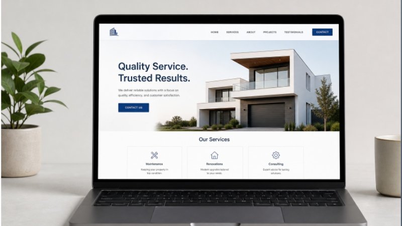
Minimal web design is still valuable because people want to understand a page quickly. Browsing minimal ui examples can provide visual inspiration, but a successful website needs more than a quiet color palette, oversized type, and open space. It needs to help people complete a task without confusion. In 2026, a clean design should support mobile reading, faster decisions, and confident next steps. Minimalism is a method for reducing noise. It is not a reason to hide prices, service details, policies, contact options, or the information a visitor came to find.
Why Minimal Design Still Matters
Visitors often scan before they read. A focused layout lets them identify the page topic, find the main action, and decide whether the content applies to them. Fewer competing banners, pop-ups, animations, and visual styles can make that process easier.
Thoughtful simplicity is very different from an unfinished page. A sparse page with vague messaging may look polished, yet leave users wondering what the business does or how to proceed. Every visible element should have a job, but useful information should remain visible when it helps a person make a decision.
Start With the User’s Main Question
Before choosing fonts or spacing, identify the first question a new visitor needs answered. For a service business, that may be “What do you offer, where do you work, and how do I get started?” Put the clearest answer near the top, then use later sections to address natural follow-up questions.
- State what the page offers in plain language.
- Place the main action close to that explanation.
- Remove repeated claims, broad slogans, and filler copy.
- Review the page as someone seeing the business for the first time.
For example, a local plumbing company can show its service area, hours, emergency availability, booking option, and basic process near the top. Those details are more useful than a large decorative image that pushes essential answers down the page.
Build a Clear Visual Hierarchy
A visitor should be able to skim a page and understand its structure without reading every sentence. Use one strong page title, section headings that describe what follows, and short paragraphs that handle one idea at a time. Size, weight, position, and spacing should show importance without making every element demand attention.
- Keep related text, buttons, and controls close together.
- Use a consistent heading scale across the site.
- Give primary actions more emphasis than secondary links.
- Avoid stacking multiple bold headlines or competing calls to action in a single view.
Use Whitespace With a Purpose
Whitespace groups related ideas, gives text room to breathe, and helps important actions stand out. It can also helpfully slow the reading pace. However, excessive gaps can disconnect a heading from its paragraph, make a page feel empty, and force users to scroll past too much space before finding an answer.
Keep headings visually connected to the content they introduce, use consistent spacing between similar components, and give buttons enough room to tap comfortably. Always review spacing on smaller screens, where large desktop gaps can become frustratingly long.
Keep Navigation Visible and Predictable
Clean design should not rely on mystery-meat icons, hidden paths, or unusual interactions. Familiar labels such as Services, About, Resources, and Contact are often better than clever alternatives because they set clear expectations.
- Keep primary navigation short and focused.
- Use descriptive link text that explains the destination.
- Show users where they are on larger sites.
- Make the search easy to find when the site has substantial content.
- Ask someone unfamiliar with the site to complete a common task.
Make Simple Design Accessible
A restrained visual style is not automatically accessible. Readable text, strong color contrast, visible keyboard focus states, meaningful alternative text, clear form labels, and keyboard-friendly controls all remain essential. The WCAG 2.2 guidance is a practical reference for reviewing contrast, headings, focus order, labels, and other parts of a usable experience.
Do not rely on color alone to communicate status, and do not remove outlines simply because they seem visually disruptive. A focus indicator may be the only way a keyboard user knows where they are. Clean design works best when clarity includes everyone, not only people using a mouse and a large screen.
Pair Clean Layouts With Useful Content
Minimal websites can offer depth without becoming cluttered. Replace generic promises with specific explanations of what users receive, who the service is for, how the process works, and what happens next. Use bullets for requirements and steps, and add examples where a concept may be unclear.
The goal is not to reduce the page to the fewest possible words. It is to put the right amount of information in the right order, close to the moment when a user needs it. A calm layout should make answers easier to absorb, not harder to locate.
Protect Performance Without Flattening the Experience
Performance is part of simplicity. A page that shifts, freezes, or takes too long to load does not feel effortless, regardless of how clean it looks. Compress large images, use modern formats where appropriate, limit unnecessary scripts and third-party widgets, and reserve space for images, banners, and embedded content before they load.
Test on a real phone and an ordinary mobile connection, not only fast office Wi-Fi. Also, use motion carefully. Brief transitions can confirm an action or explain a state change, but autoplay effects and constantly moving elements distract from content. Respect reduced-motion preferences, and ensure hover-only interactions still work on touch devices.
Review the Page With a Practical Checklist
- Can a new visitor explain what the page offers within a few seconds?
- Is the main action easy to find without having to guess?
- Are important details available without needless clicks?
- Does the page work with a keyboard and remain readable on small screens?
- Do images, fonts, and scripts load without disruptive layout shifts?
- Does every section contribute useful information?
How to Test a Minimal Website With Real Users
You do not need a large research budget to spot major problems. Ask three to five people to find a specific detail, such as a price range, delivery area, or return policy. Watch where they pause, scroll back, or choose the wrong link. Then ask them to describe the page in their own words.
Compare their behavior on desktop and mobile, and fix recurring issues before polishing minor visual details. Teams become familiar with their own layout, so real visitors often reveal missing context and unclear paths that internal reviewers no longer notice.
Questions Readers May Have
Is Minimal Web Design Good for Every Website?
Most sites benefit from clearer structure and fewer distractions, but the right level of simplicity depends on the audience and task. A complex product may need detailed filters, documentation, or comparison tools. Those features can still be organized clean.
Can a Minimal Website Still Rank Well in Search?
Yes, provided visual simplicity does not replace useful content. Pages still need descriptive headings, relevant copy, internal links, and complete answers that match the visitor’s goal.
How Much Text Should a Minimal Website Have?
There is no universal word count. Include enough detail to answer reasonable questions, then remove repetition and unsupported claims.
What Is the Biggest Mistake in Minimal Design?
Hiding essential information is the most common mistake. A page fails when visitors cannot find service details, prices, policies, contact options, or next steps.
Final Recommendation
The strongest minimal websites are not the ones with the fewest elements. They are the ones where every element feels necessary, readable, fast, and easy to use. Remove noise, keep helpful details visible, test with real people, and treat accessibility and performance as core design work. That people-first approach also reflects helpful, reliable content created for people, rather than pages designed only to appear clean or chase rankings.